Audible
I must issue a mea culpa. Intoxicated by the excitement of experimenting with a different approach to designing websites, I jumped into this live redesign without truly thinking through how much time would be required to work out the ideas I had in mind. Not to mention the additional efforts of writing about it as I went.
Further, upon an audit of my strengths (not writing), responsibilities (providing for my family), and current season of life (scarce “side time”) it came to bear that the most important thing to focus on in terms of personal websites was a portfolio of work that showed what I’ve been up to for the past few years and a design that could be implemented quickly.
So, I will no longer be moving this site in the direction of what I had envisioned initially. The design to be put in place is now defined by a different set of rules (more on this below) with a goal to be live on February 29 — a fun launch day if there ever was one.¹ Okay, okay, May 1st is a more likely candidate for launching this thing.
—
Now, for posterity’s my sake, I want to show some of the work and thoughts that came out of the initial design program I was working on.
The main idea centered around using something other than visual elements to unify the site. Most sites maintain cohesion from page to page, section to section by using the same colors, fonts, spacing, sizes, etc. Call it a style guide, a design system, whatever. It’s those elements in aggregate that make up the unique identity of the site.
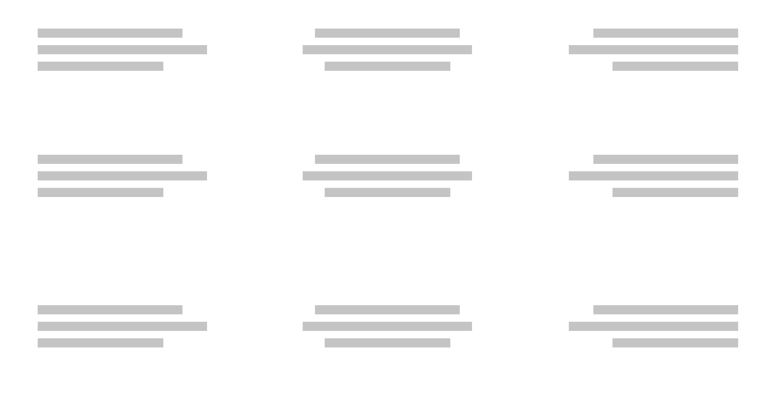
What I was working through was the idea of using a content pattern as the main unifier for the site. Specifically a trio of content types: title, meta information, and body content placed on the screen from top to bottom in that order. The order of these content types applied consistently to each view, not the specific font, size, or color of the content types, would provide the visual anchor to hold each view in relation to the other.
So this:
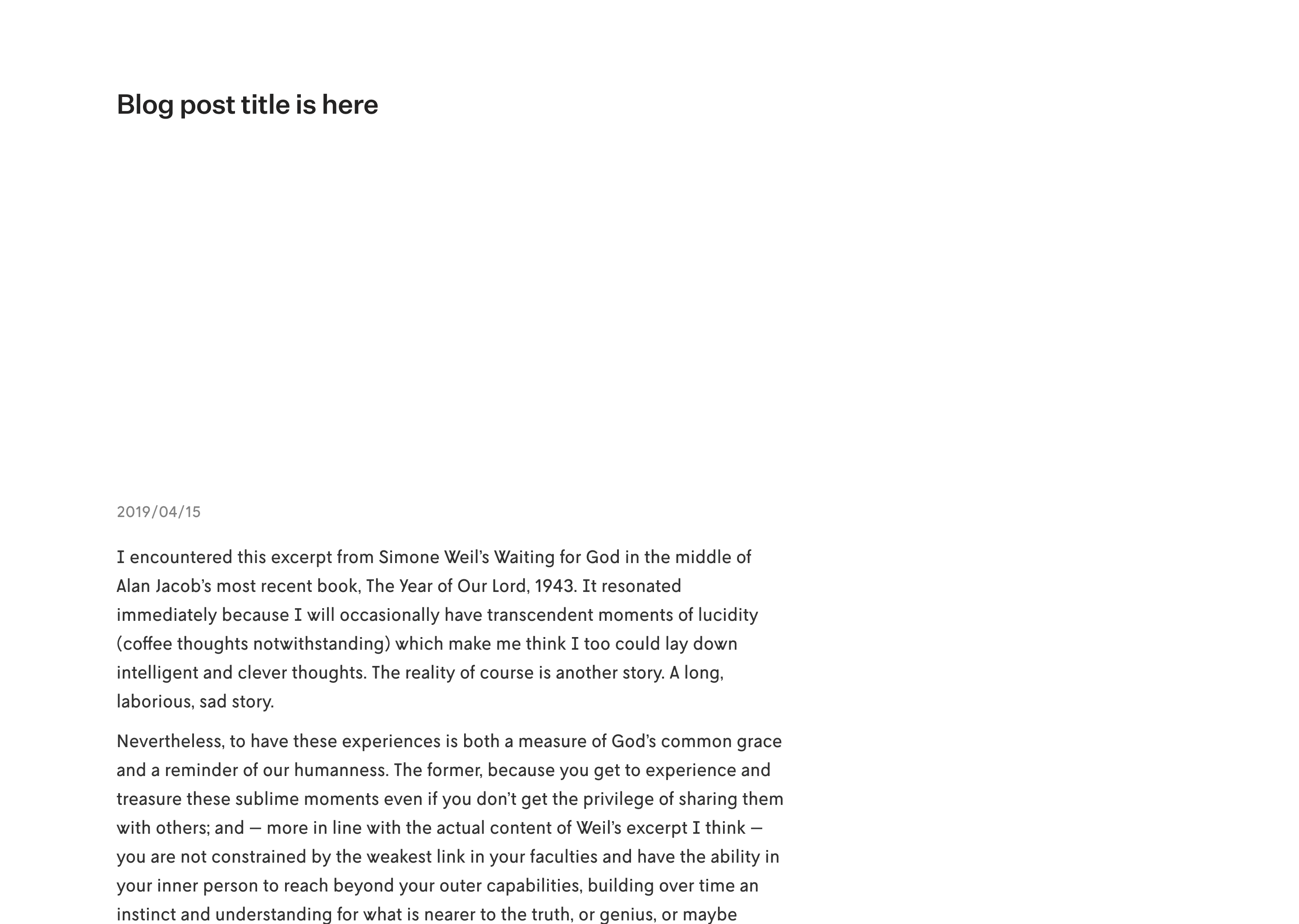
Would be just as valid as this:
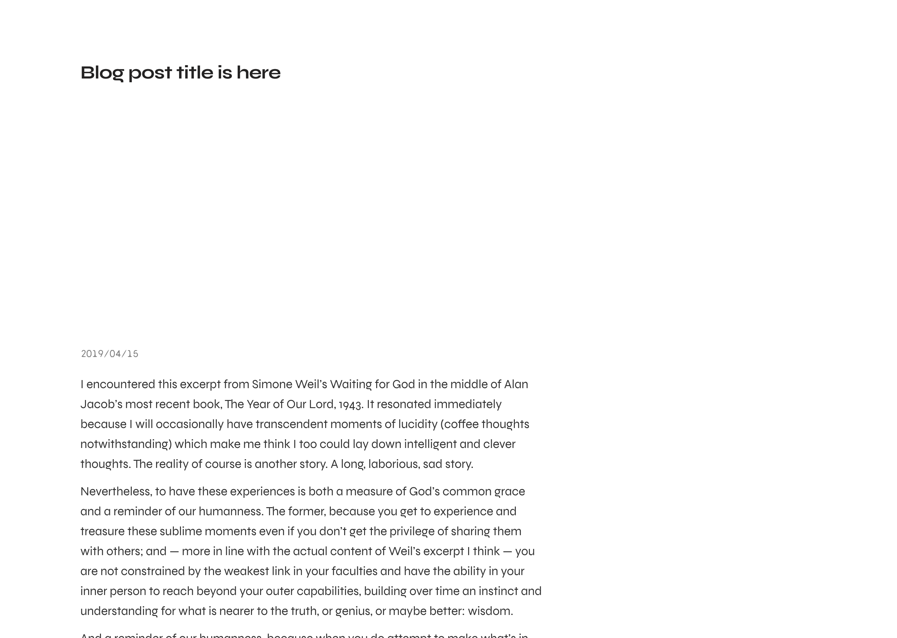
Or this:
Or even this:
There would be other rules too. One seen in action in the series above on the last image is the placement of the main title: it could be placed at the top of the screen, the bottom of the screen, or the middle of the screen, and then the text could be left-, right-, or center- aligned. (The meta and body content — if present — would follow the title’s lead in placement, but could carry their own alignment.)
So you had nine potential options for the main title (or if no title was present, for the meta information, or the body content if no title or meta was present):
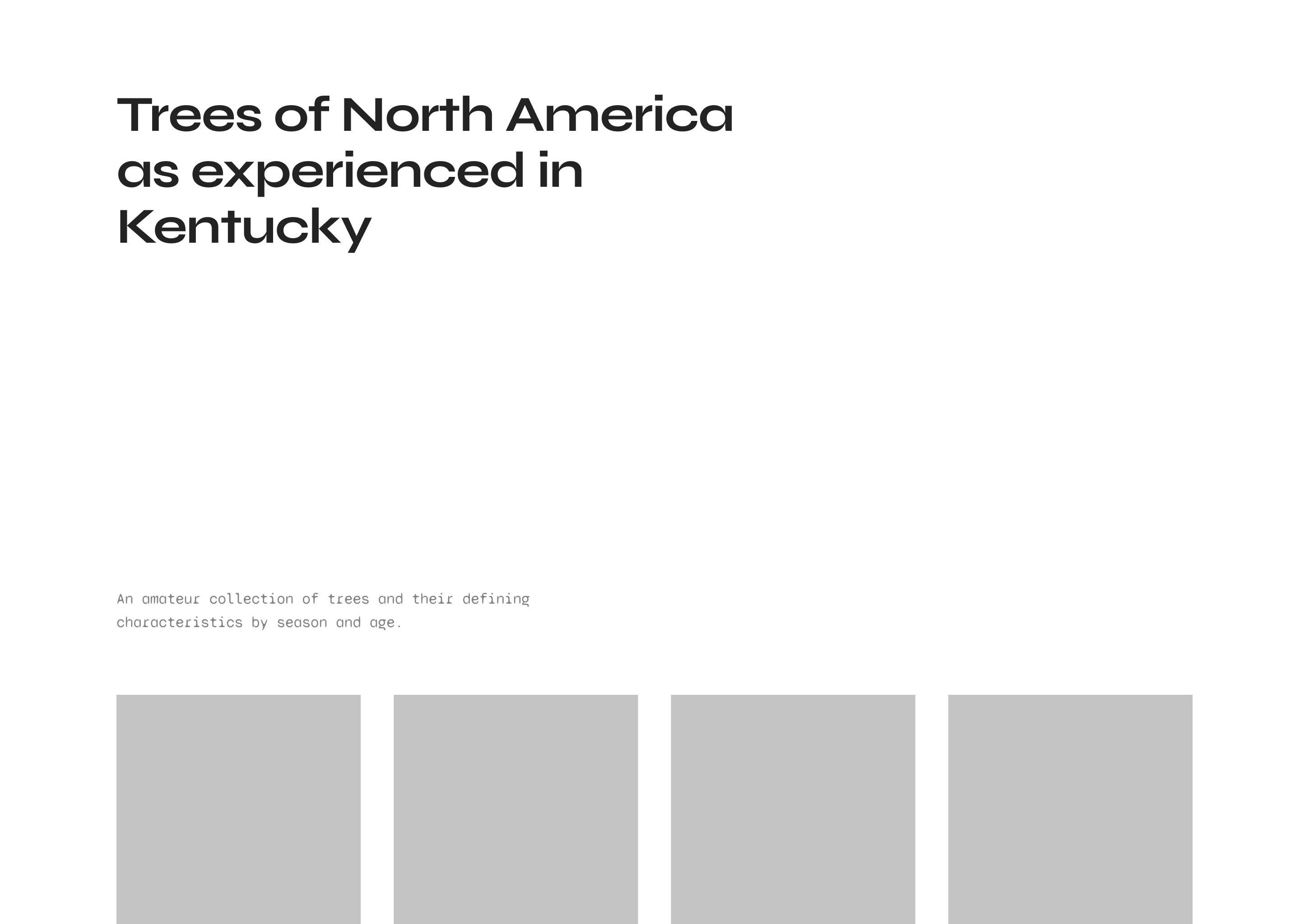
Applying those rules, I was sketching out the home page design to look something like this:²
And then the type could be changed too since there was no rule on a headline having to be a specific typeface:
There was a plan to corral the different typefaces though by constraining them to predefined sets: within each set the fonts would harmonize thematically, and then without, in relation to other sets, there would be coordination to keep a uniform color on the page. For example, body text in one font might be 18px whereas in another set the body text font would be 19px to produce an equal text block when viewed as a macro element.
However the type sets were always going to be open so if I ever came across a new font that I liked I wouldn’t feel the urge to redesign my site to try it out, I would just drop it in the system!
The new “program”
What I’m working on now is a little more let’s say traditional. A design with the familiar trappings of a website. However, one thing I’m doing that I’ve always wanted to do and have almost done but didn’t quite do is use only one font at one size throughout the entire site. See those italics? I won’t even be able to do that.³
I mention the single font approach because it’s the main thing that’s unique, but also because it’s a nice setup to be able to swap out the font from time to time and keep a small part of the original vision alive. Say on my birthday I switch it to my favorite font for websites: L10 Regular. Or on the weekends it switches to Faune. Maybe on April Fool’s it switches to Tiempos Text and so forth.
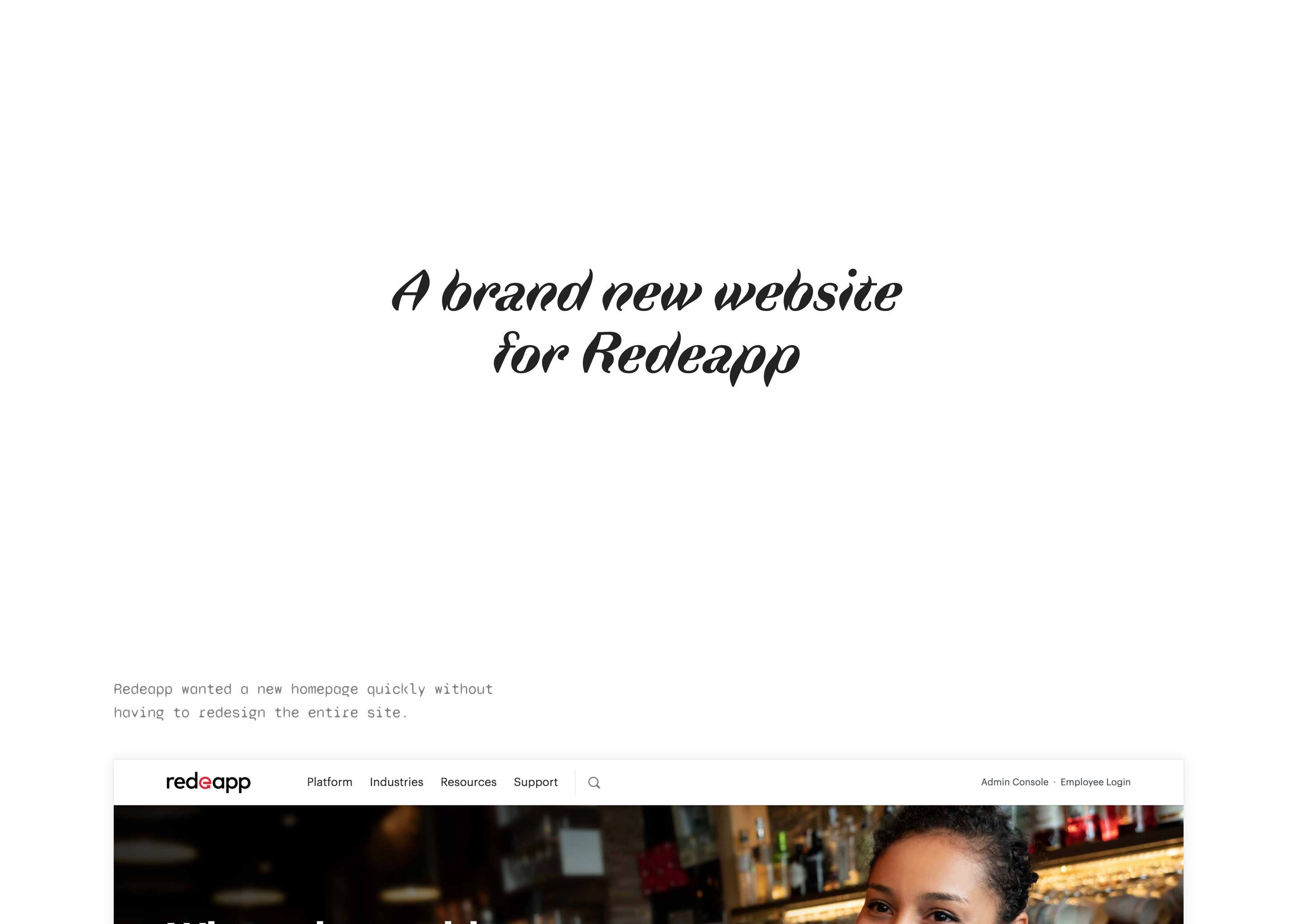
So anyways, that’s the plan for moving forward — here’s a sneakpeak of the design (spoiler, the font is Unica77):
Footnotes
- There actually used to be a specific day each year, May 1st, when designers would simultaneously publish their website redesigns. It was a lot of fun to participate in and see all the new sites published at once. Long live the old personal web!
- Figuring out how the header and footer would interact with the content patterns was a work in progress that I never resolved satisfactorily.
- I will be using a monospaced font for code samples, but I’m treating those more as a graphic than part of the type setting. Inline code references will be set with the single font (as of this writing). Though eventually I may add the italic version, we’ll see…