Grid
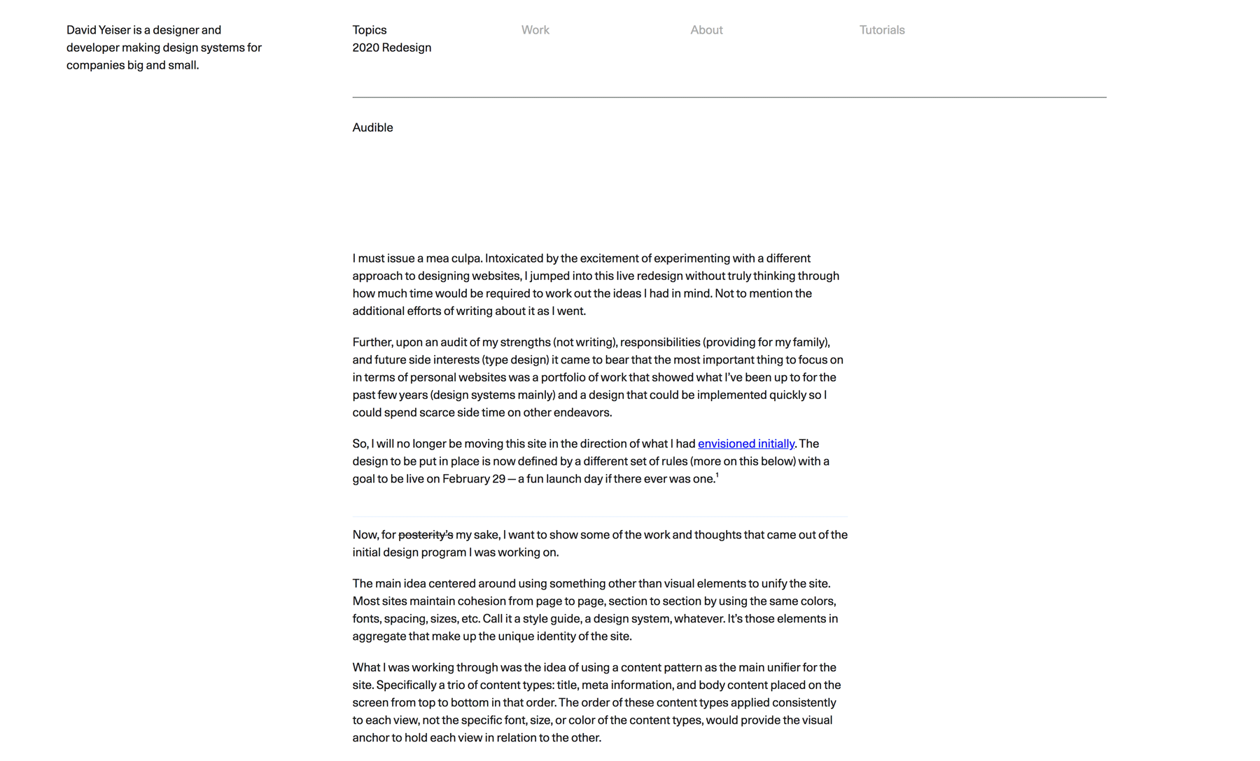
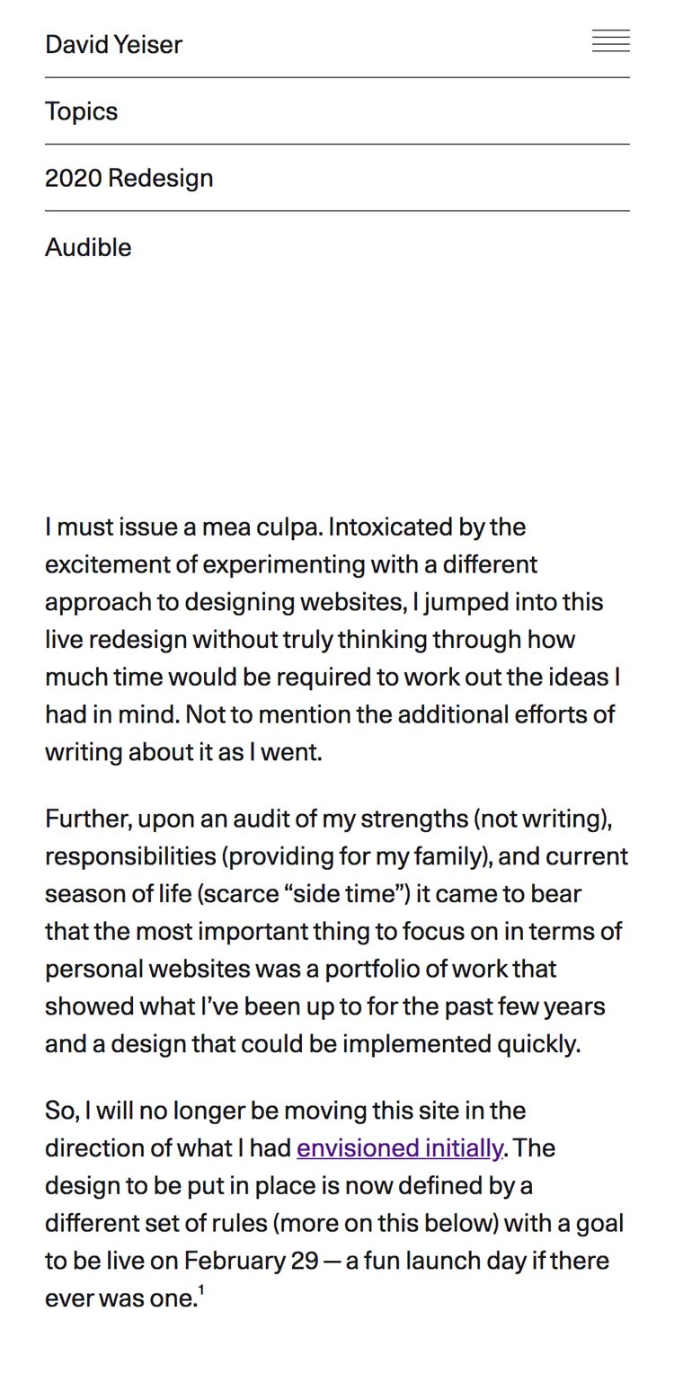
The new design for this site is well underway though I did have to push the “launch” date back a couple months to May 1st. (Putting together a portfolio takes a lot of time and is not a lot of fun.) In the meantime I wanted to jot down a few quick notes about the new design’s underlying grid structure and share a few screenshots.
At first I didn’t have a grid, I approached it more like a book layout and set the surrounding page margins with essentially a left column, right column and type measure to govern the main content layout.
But managing a steady proportion to the layout as it adjusted for the responsive breakpoints quickly grew complicated; and the general atmosphere created by the layout felt drab. It had no energy.
Rather than try to fight it I gave in and decided to switch to a parent grid for the entire site layout. The “left” and “right” sides would be laid out not according to scale values but by spanning a defined number of columns. I also switched my type and dimension scales from the golden ratio (1:1.618) and ISO system (1:√2) to a Minor 3rd and 7th scale (1:1.2 and 1:1.778, respectively, thank you Elements of Typographic Style). And, to keep my sanity as much as a coherent presentation throughout the site, I drastically reduced the number of available dimensions.
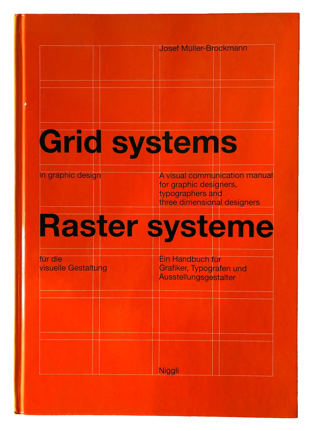
Anyways, back to the grid. For inspiration I pulled out my copy of that ubiquitous orange book on grids, Grid systems in graphic design by Josef Müller-Brockmann.
My attention was drawn to an example on page 129:
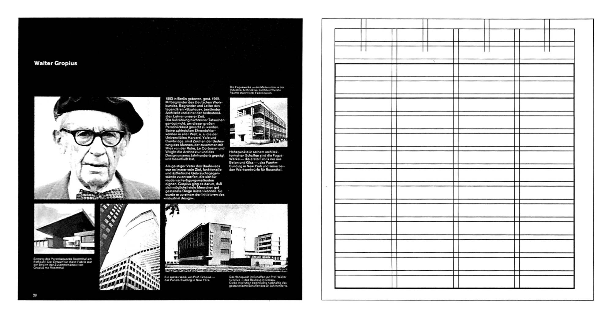
I liked the wide columns and how they were each subdivided into two columns. It had a good feel to it and seemed like it would be flexible to allow for various types of content and layouts, basically something that could last a long time. So, with reference in hand I set about changing my Flexbox layout to CSS Grids. Aside: CSS Grids are an amazing technology and I can only dream of the fun we would have had with them back in the day of fixed web canvases.
I had used CSS Grids a couple years ago for a site design and found them easy to work with once you grasped the initial syntax. And this time was no different. Not only did they work beautifully, I was able to discard a lot of margin and padding rules I had had in place prior. The main aspect I found missing was the ability for nested child elements to reference a grandparent’s columns (or rows) but I worked around this by abstracting the template columns and rows to separate classes and reusing them as needed. And from what I understand this functionality is being worked on for CSS Grid 2.
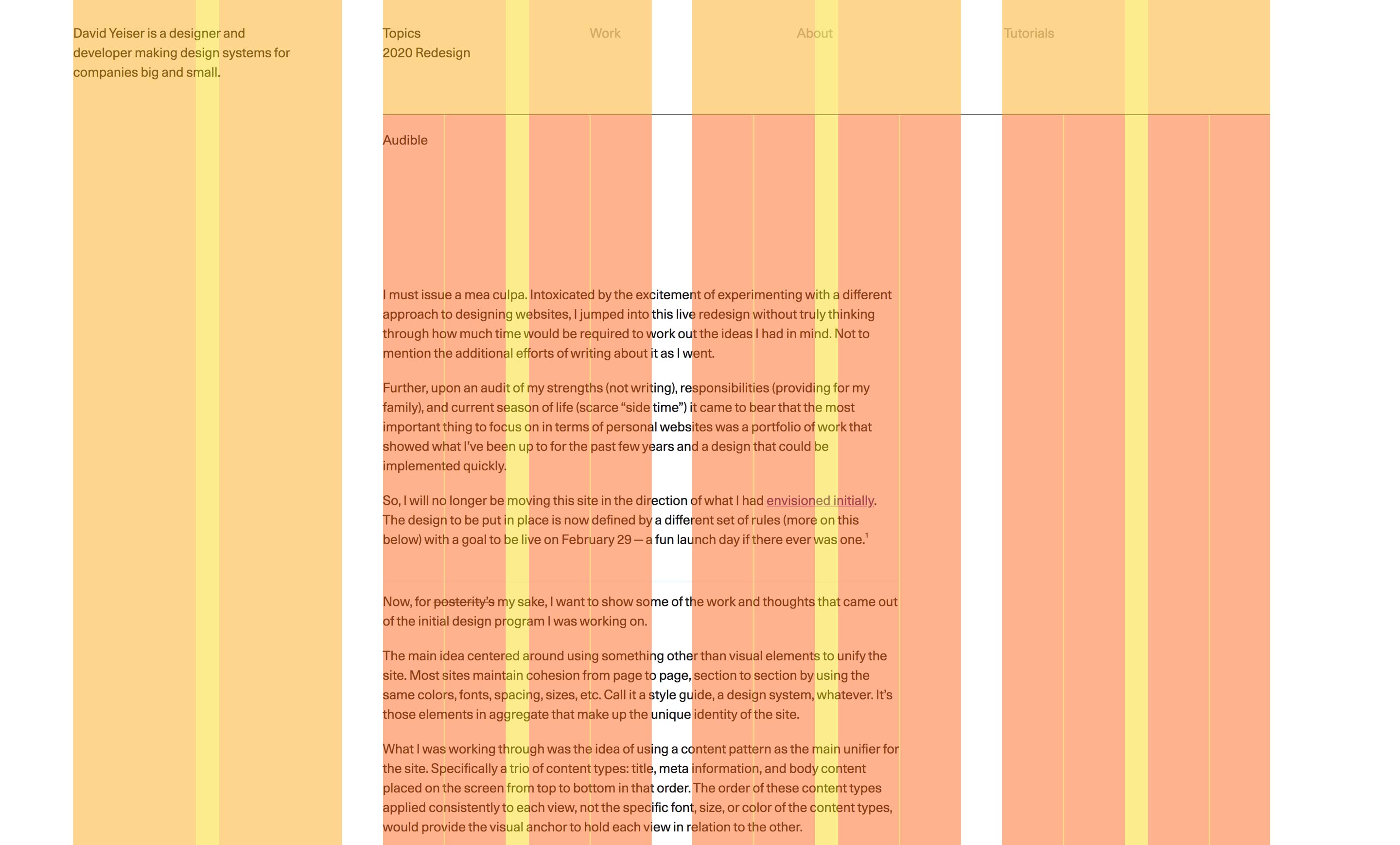
The final site layout grid consisted of four columns separated by a wide gutter with each of the columns themselves divided into 2 equal columns separated by a smaller gutter.
/*
Defining gutters as columns since they are not equal width
(grid-column-gap only accepts a single value).
There were defined rows as well, but only focusing on the
columns for this post.
*/
.site-grid-columns {
grid-template-columns:
[col-1-start] 1fr
[col-1a-end] 2rem
[col-1b-start] 1fr
[col-1-end] 3.5625rem
[col-2-start] 1fr
[col-2a-end] 2rem
[col-2b-start] 1fr
[col-2-end] 3.5625rem
[col-3-start] 1fr
[col-3a-end] 2rem
[col-3b-start] 1fr
[col-3-end] 3.5625rem
[col-4-start] 1fr
[col-4a-end] 2rem
[col-4b-start] 1fr
[col-4-end]
;
}
The animated image below shows the differences between the old layout and the new after the grid was implemented.
But of course this wide desktop screen is not the only viewport. Starting from the widest view and working backwards, as the viewport shrinks the first column halfs its value and then as the viewport continues to narrow the inner gutter for the first column is dropped completely. The code to implement this change was easy:
@media (<breakpoint-md>) {
.site-grid-columns {
grid-template-columns:
[col-1-start] 0.5fr
[col-1a-end] 0
[col-1b-start] 0.5fr
[col-1-end] 3.5625rem
...
;
}
}
@media (<breakpoint-lg>) {
.site-grid-columns {
grid-template-columns:
[col-1-start] 0.5fr
[col-1a-end] 2rem
[col-1b-start] 0.5fr
[col-1-end] 3.5625rem
...
;
}
}
@media (<breakpoint-wd>) {
.site-grid-columns {
grid-template-columns:
[col-1-start] 1fr
[col-1a-end] 2rem
[col-1b-start] 1fr
[col-1-end] 3.5625rem
...
;
}
}
And then once the “tablet” breakpoint is hit the CSS Grid layout is disabled and Flexbox takes over. At this point everything is 100% width of the content with the outer frame element providing the margins around the screen.
That’s the grid that governs the site layout. For the main content area I created another grid that mimics the main site grid with the addition of half lines for each of the eight columns.
As can be seen from the screenshot, I use the half-lines for adjusting the type measure (and breakout images as well).
The navigation did not quite work with the site grid. The area had three major columns, six counting the sub columns and then 12 if you counted the halves introduced for the main page content grid. There were more navigation items than major columns so those wouldn’t work as alignment guides, the half columns as guides created too small a space. So what I did was take the span of the first half column plus the gutter next to it and half of the second half column to get a width value that I applied to all the navigation items. From that complex calculation came a very simple singe value that spaces the navigation nicely.
Lastly, for the portfolio pages, I created another “subgrid” that matched the main parent grid and then established two sections:
- A full-width section that spans the entire grid and then uses negative margins to break out of the parent frame and create a content area that is flush with the viewport.
- A default section that spans the second and third major columns to created a centered view.
Both of these layouts lend themselves better to a presentation of successive images and short text snippets.
Overall I am happy with the grid and hope no one visits the site in IE 11.