Unselfconscious design
One of my favorite books on design — another book written in 1964¹ — is Notes on the Synthesis of Form by Christopher Alexander. The main thrust of the book is an approach to remove problem solving from the designer’s head and place it in the world to abstract it into a diagram, or program, which can then be used to construct the proper form to solve the problem. It’s an argument that we are a selfconscious society with insufficient methods to operate effectively within one.
The selfconscious society is compared in the book to its opposite, the unselfconscious. The unselfconscious designer (or society) creates forms based on traditions. The selfconscious designer, divorced from any tradition that would instruct what a form should be, designs from their mind.
Take these two excerpts from the book, the first on the unselfconscious designer:
In the unselfconscious system the individual is no more than an agent. He does what he knows how to do as best he can. Very little demand is made of him. He need not himself be able to invent forms at all. All that is required is that he should recognize misfits and respond to them by making minor changes.
And then on the selfconscious designer:
Selfconsciousness brings with it the desire to break loose, the taste for individual expression, the escape from tradition and taboo, the will to self-determination. But the wildness of the desire is tempered by man’s limited invention. To achieve in a few hours at the drawing board what once took centuries of adaptation and development, to invent a form suddenly which clearly fits its context — the extent of the invention necessary is beyond the average designer. (Notes on the Synthesis of Form, p.59)
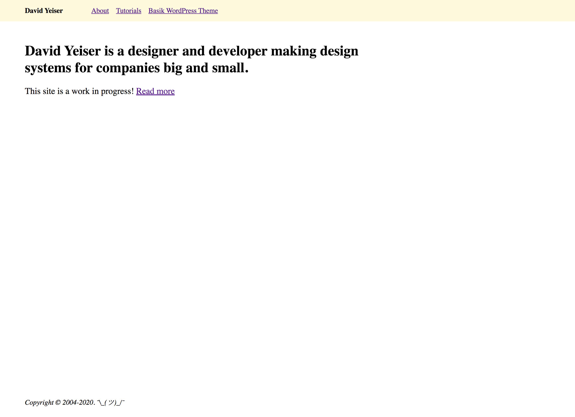
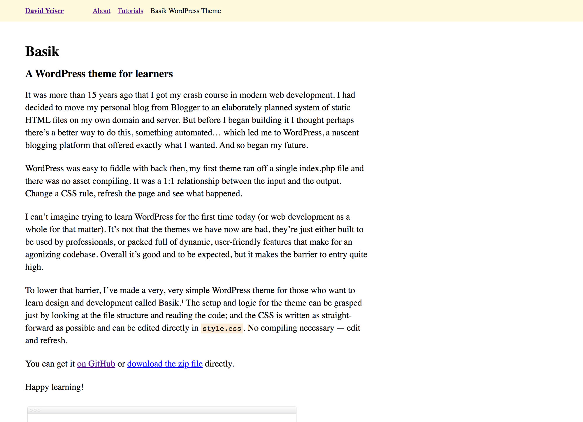
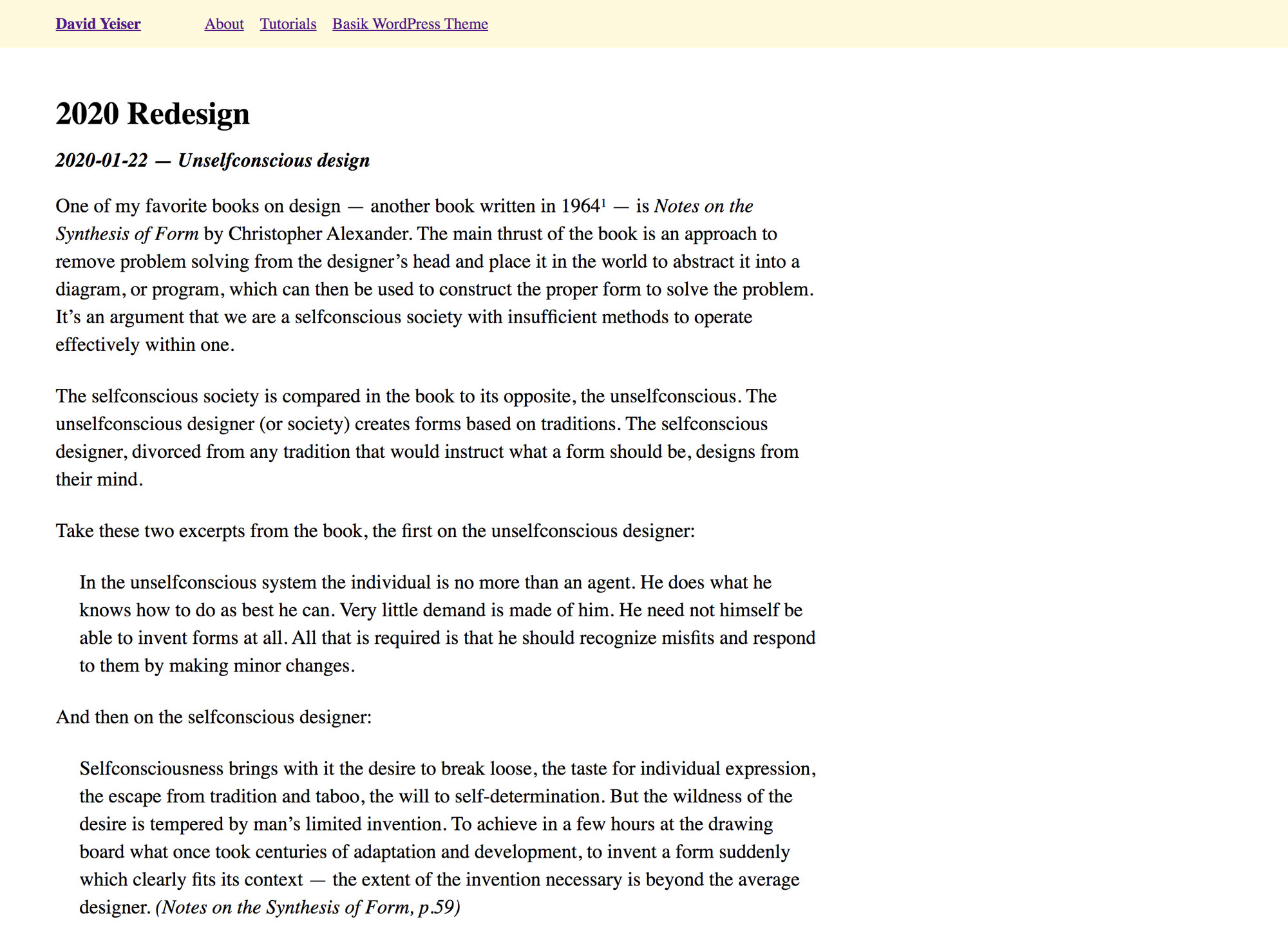
I bring this up because the process of forming this website in its current “undesigned” state felt very much like a participation in an unselfconscious process. I entered the text, the browser rendered it, and then I shaped it in response to what it needed to be. The paragraphs required constraint and space between one another so they could be read. The titles were given larger sizes and bolder weight to be known as titles. The header was placed simply at the top and the footer at the bottom. Mostly I took on the base forms given to me by the browser defaults and web traditions (blue and purple links). Even now with this post, I added two blockquotes, noticed they looked no different from paragraphs and corrected the misfit by adding a left margin to indent them a bit.
There was a satisfaction and ease in shaping this current design that finds its opposite when I try to “design” a website — that is met with frustration, imposter’s syndrome, fatigue and piles of thrown-away work. I have a bit more to write on this later perhaps, but for now I just wanted to record the moment and save a few screenshots for later reference when the design of this site moves away from its unselfconscious roots.


Footnotes
- See prior note: System solution.