Automated Token Documentation
2019-2020- Role & ResponsibilitiesDesign, front-end architecture and build, backend architecture and build.
- Technologies & ToolsNext.js, JavaScript, TypeScript, CSS/HTML
- Years2019–2020
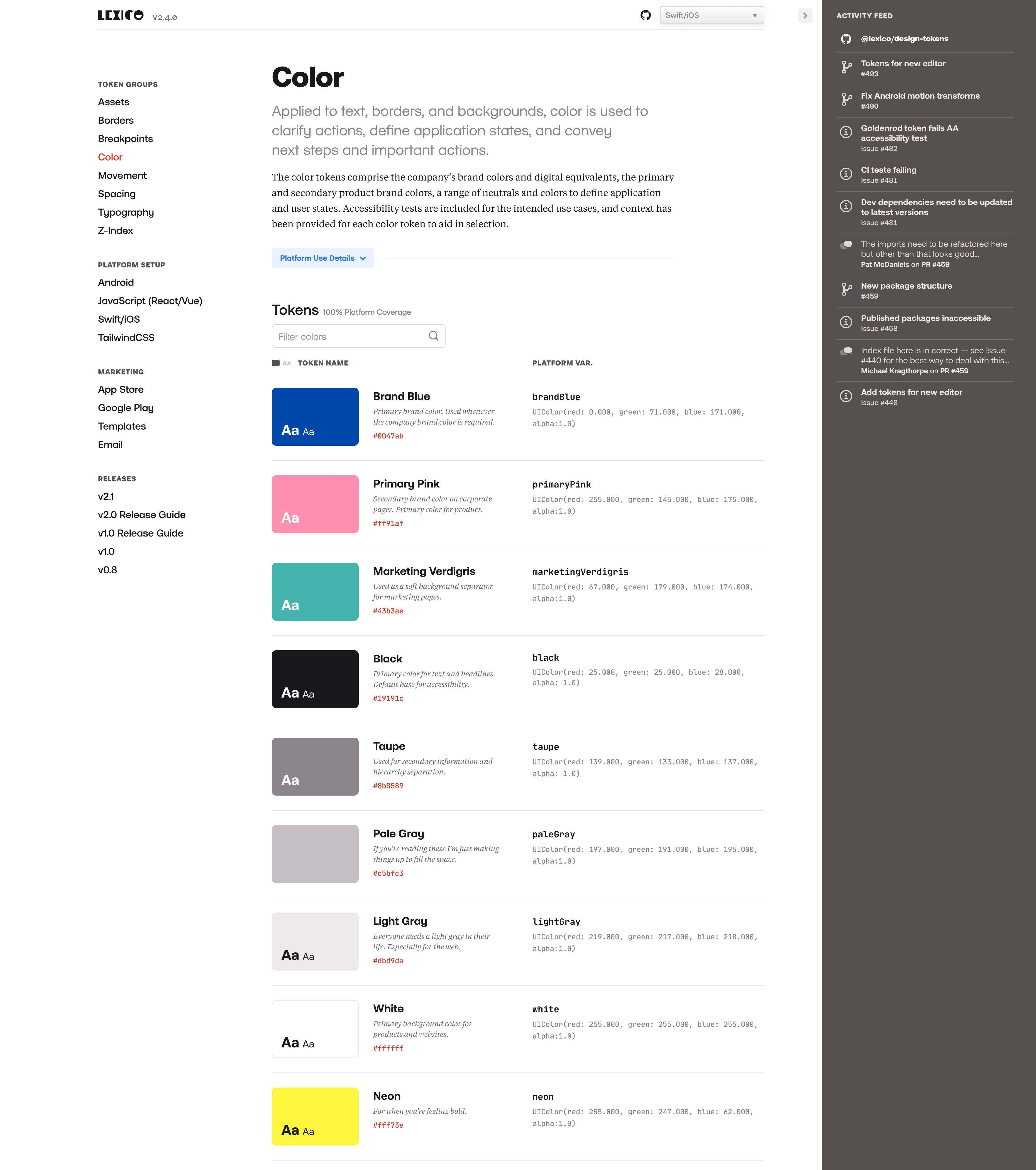
Note: This project proceeded from the Design Token Transformation project and like that project was performed under NDA and cannot be shown. The description that follows is fully accurate but the accompanying visuals, while they represent the idea of what we did for the most part (except for that GitHub feed in the sidebar, we never did that, but it would be neat!), are completely fake. There is no such thing as Lexico, or Acme, Inc.
A not insignificant part of the Design Token Transformation project involved documenting what design tokens and transformations were, how they should be used, platform set up and use instructions, as well as complete tables of transformed token variable names and values to reference for each platform.
The word count for all this documentation had grown to around 40,000, and all of it was stored in Markdown files READMEs in the project’s code repository. What this meant is that any time there was a change in the tokens, the documentation had to be updated by hand. This was tedious, took a long time, and was prone to user error. It got to the point where documentation was responsible for the majority of the time it took to make a change to a token and release an update.
The effort was 100% worth it, of course — the engineers appreciated the thoroughness of the documentation immensely. But we knew there was a better way to manage and provide it.

Goal
The pieces of the documentation that were the most onerous to update — the transformed design token variables and values for the platforms — were also the most structured: they were in a predictable form, stored in static, known locations. This provided a happy opportunity to automate a large portion of the documentation, reduce the chance for human error, and give back a lot time to work on other parts of the product.
And further, we could provide a better overall experience for engineers referencing the token values by combining other parts of the documentation alongside the automated content to form a sort of design clearinghouse. So with this theoretical plan in place we set about making a website.
Process & Result
Like the Design Tokens Transformation project, engineers were the primary customer so the main focus was on the developer experience. We architected the site around token classes rather than platforms which had been required by the prior setup due to the static nature of the markdown files.
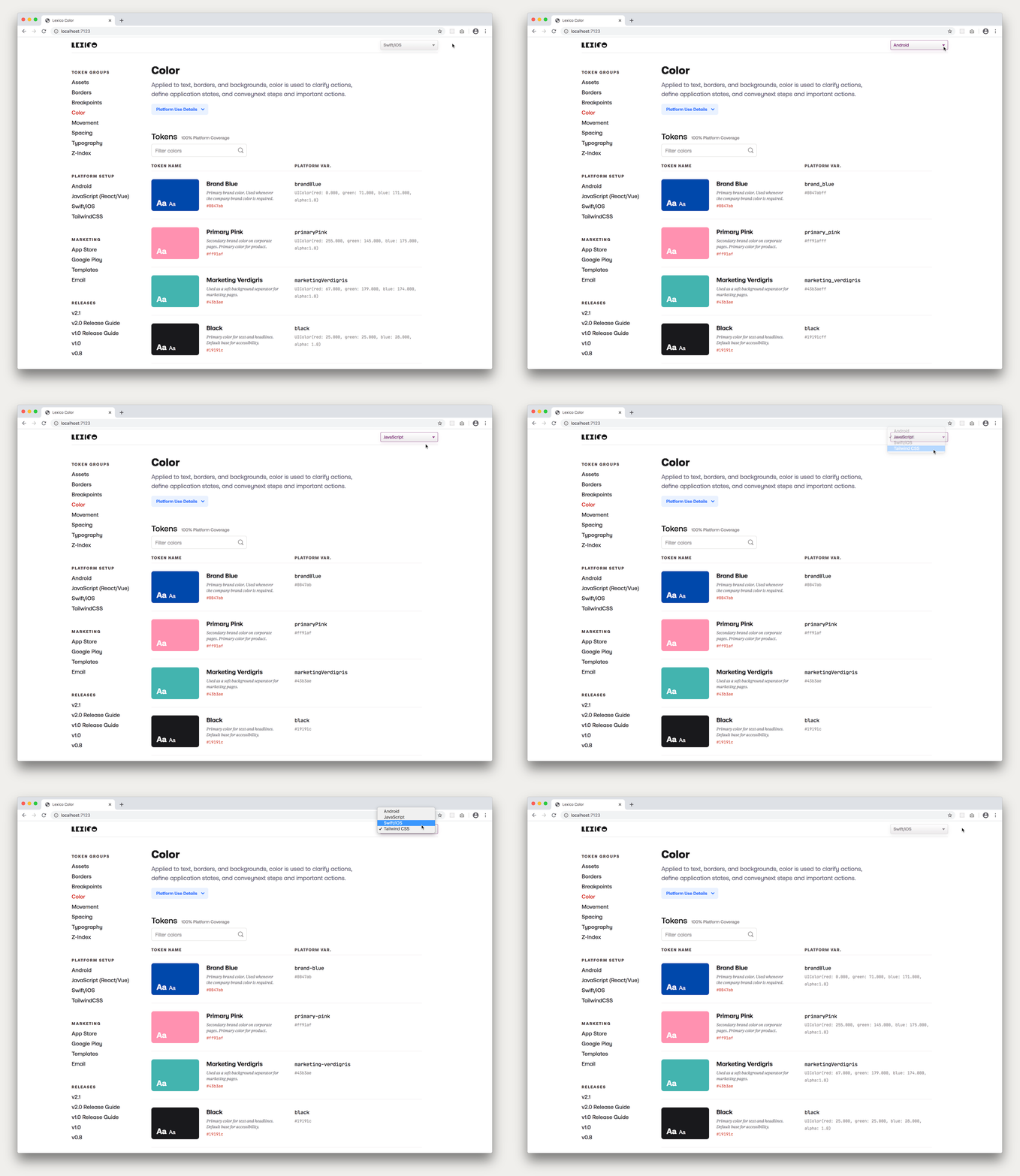
Then we instituted a context switcher which allowed the developer to set the platform context for the entire site. So whichever platform was selected, all of the transformed values and variable references and corresponding setup instructions would be for that platform alone. The end result was a documentation site tailored to each individual developer.
Once this architecture was in place, the most intense part of the site was pulling in all of the design tokens, parsing and displaying them as documentation. First the design tokens were processed in their “pure” state from their JSON files to obtain their token name, value and visual representation. And we also used the comments associated with the token (if it existed) to add additional context for the token.
So, a token like this:
{
color: {
marketing: {
verdigris: {
value: "#43b3ae",
comment: "Used as a soft background separator for marketing pages."
}
}
}
}
Would end up in a display table like this:

Then the transformed token values and variable names for all the platforms were extracted and a set of algorithms matched them to their pure token counterpart to display the tokens as auto-generated documentation with the pure design token values on one side (name, value and visual representation) and the transformed, platform values on the other (variable name and value).
So if the corresponding transformed token for the selected platform looked like this in the code:
let marketingVerdigris = UIColor(red: 67.000, green: 179.000, blue: 174.000, alpha:1.0)
It would look like this in the display table:

And both together side-by-side would look like this:

And then say if the platform switcher was changed to say Android, the table would update to look like this:

Also, since the design token values came from the published design tokens package itself, the viewer could see which version of the design tokens were being displayed on the documention site — a helpful orientation and guide. This versioning also presented an opportunity for future feature growth where engineers could switch versions of the design token documentation to match the version they were using in their platform.
Conclusion
So anytime a change was made to the tokens (edit, addition or removal), the documentation for the token and its transformed values was updated automatically. And the effort to document changes went from one of the most time-consuming tasks to not even being a task at all!
Highlight
A key feature of the documentation site was a platform switcher that set the platform context throughout the entire site. So for example if you were an iOS developer you would change the dropdown to “Swift/iOS” and then as you browsed the documentation site all the token values, variables and relevant documentation were all Swift-related. (Same for any other platform.)
