React Components
2018-2019
- Role & ResponsibilitiesUI/UX design, front-end development.
- Technologies & ToolsFigma, React, HTML/CSS, JavaScript, Storybook
- Year2018-2019
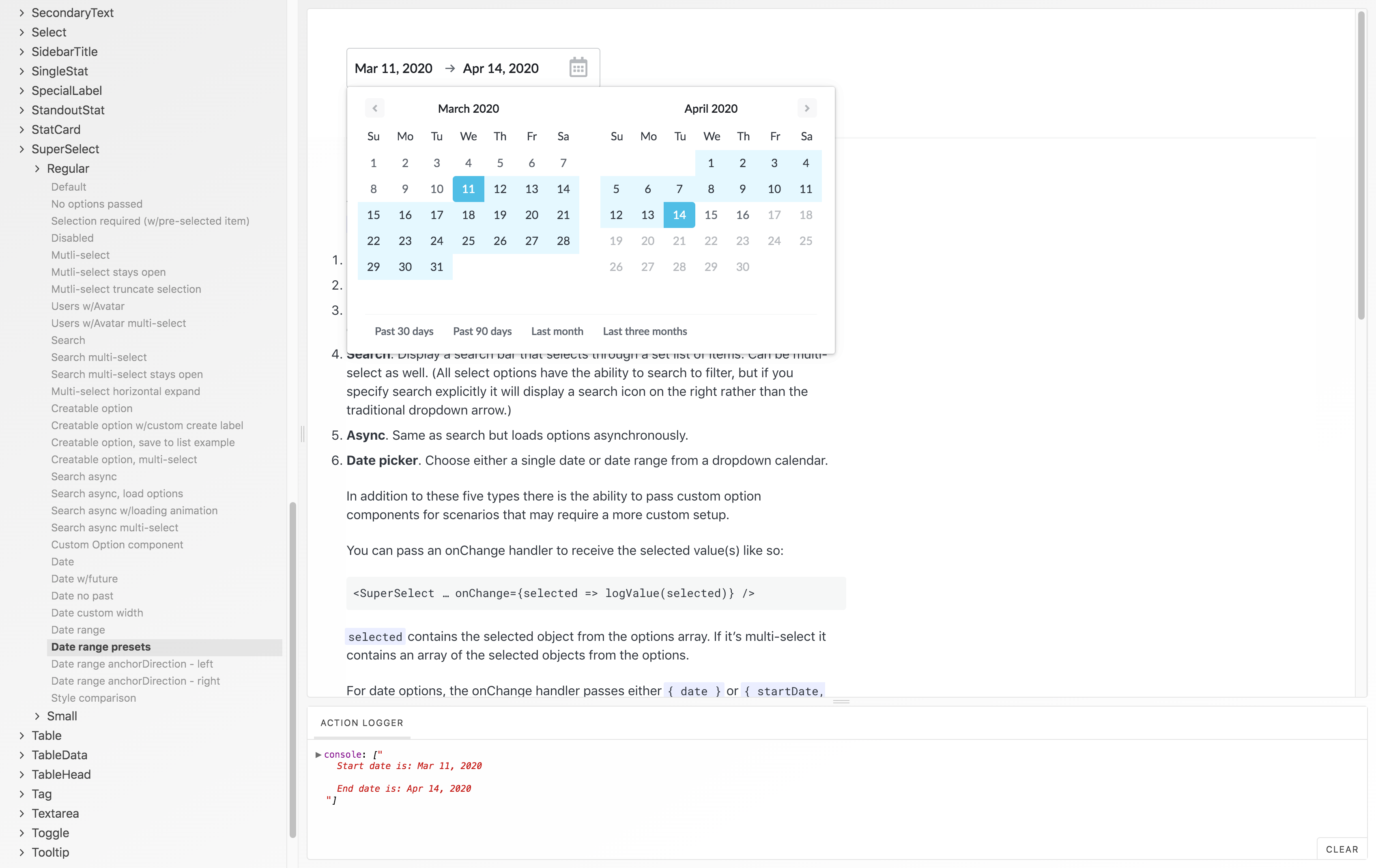
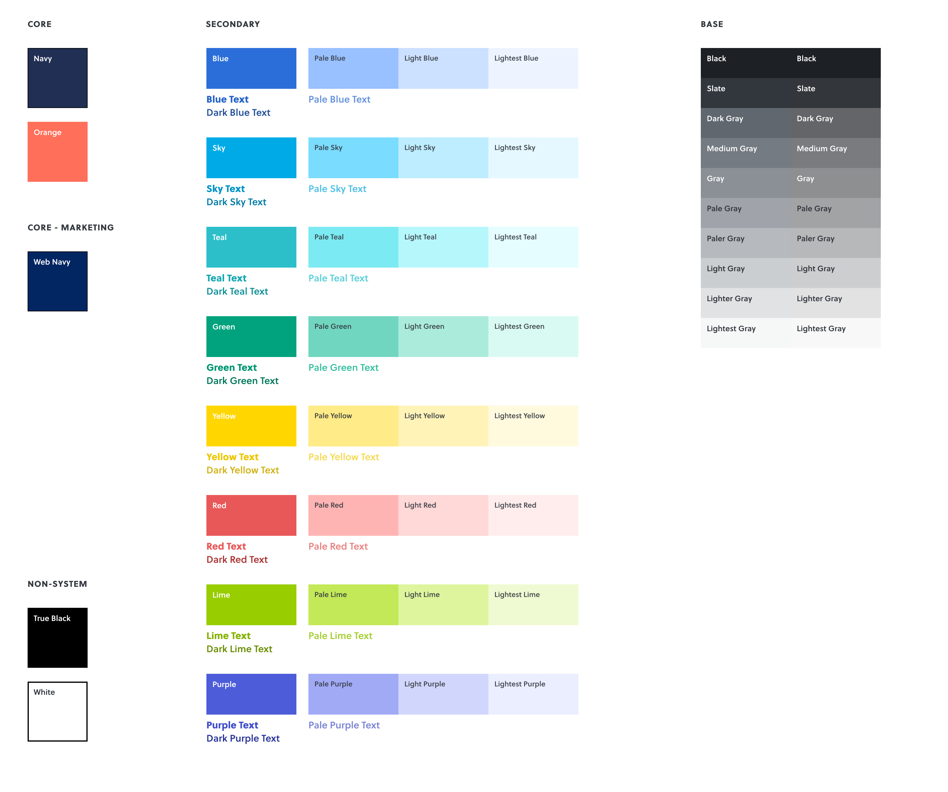
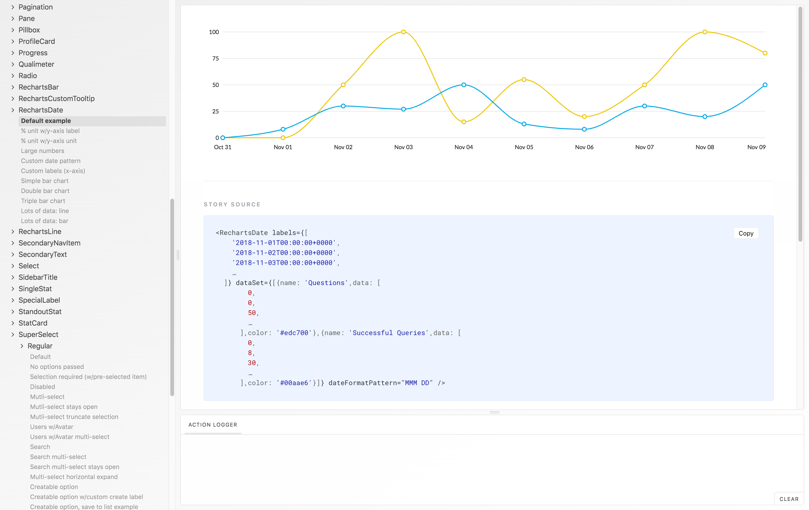
Note: The majority of the work for this project is under an NDA and cannot be shown. This includes most of the design work I did. However, I’ve gathered generic components from the design system to add some visuals to the narrative.
Also note that the components above and the chart graphs and input examples below were designed by Rachel Seo. As the project progressed I shifted from design towards more of a developer role — writing the markup, styles and code for the React components.
—
In 2018, I was hired by a startup to help with the design of their web app’s user interface (UI) and overall user experience (UX). Collaborating with another designer on their team, we worked on new product ideas and rethinking approaches to existing parts of the app.
Rather than start from scratch, we used the existing ingredients (colors, fonts, spacing and size scales, etc.) and as we designed new screens began to refine the layout patterns, the spatial relationships within and around the individual components, the typographic styles and hierarchy, the colors et al to polish the details of the foundation UI as well as the overall look and feel.
After the initial refinement work, we began to extract components and common patterns from the designs and further systemitize the design tokens that underlay the components. This collection of components and tokens formed the basis of the design system.
React Implementation
As the component library began to take shape I began to convert the components from designs in Figma to React components. We set up the React component library in its own Git repository and used Storybook as a front-facing interface to browse the component library and their various states.
We used Emotion for styling and hooked in the design system values via Emotion’s ThemeProvider. We also integrated the tool styled-system which makes creating interfaces (and responsive design) a breeze.
The initial React library numbered over 60 components and covered a broad range in terms of scope, complexity and functionality. There was everything from the prototypical Button component that handled a bucketful of props and logic to components that created arrows dynamically based on border width to composite components with a dynamic range of shape-shifting based on the content passed to it.
We also brought in several 3rd-party libraries and styled them to match our design system exactly. This was a lot of work at times but it paid off — we gained a large amount of functionality for free that matched the rest of the product.
I had the pleasure of writing my most obscure CSS rule to date as part of those style integrations:
> div > div > div > div[style^="top:"] div[style^="width: 600px;"] {
…
}
—
The design system components were added to the product as a package dependency and were used directly in production. Writing production-level components allowed us to bring the design into the product immediately and didn’t create any additional burden for the engineering team.
This setup let the engineers access the design components as needed and bring the design system into the product over time rather than all at once. And since the new design components were wrought from the same ingredients, they maintained an agreeable harmony with the parts of the app that were not yet on the design system.
Both managers and engineers alike commended the design system and React component library for enabling faster development and a more productive collaboration between design and engineering.
“David and I worked together to put together Talla’s first design system, and I’m so thankful for his design and development expertise. On top of taking ownership of the project planning and making it easy for me to collaborate on the design side with him, he implemented the system efficiently and brought our team’s engineers along during the process.”
Rachel Seo, Product Designer