Southern Magazine Website
2015-2019- Role & ResponsibilitiesWebsite design and development, project management and planning.
- Technologies & ToolsPhotoshop, WordPress, CSS/HTML, jQuery
- Years2015–2019
Southern Seminary was a long-standing client and we worked on a multitude of projects together. The main project summarized here was a project to bring their (at the time) newly designed institutional print magazine to the web.
The online magazine design was based directly on the print version of the magazine, the design of which was led by at-the-time Creative Director Eric Jimenez and Lead Designer Daniel Carroll. As such, for this project the design was more or less a solved problem, and the main challenge was to figure out the most optimal way to structure the information input and output for publishing the magazine online.
But before that process began the first step was to ensure that everyone was on the same page. There were two departments involved and I wanted to make sure that our vision for how the project was supposed to turn out was the same. To this end, I created a quick, cursory concept model for the project.
Briefly, the way you set up a concept model is to describe the main user action in a three step arrangement of X does Y on/at/with Z. And then from this main action, diagram the flows and features that accommodate, enable, and extend the primary purpose. It’s a great way to abstract the details of specialized domain knowledge that can distract from the overall picture and surface the connection points and assumptions that are necessary to understand. The concept model for the magazine project is shown below.

Design
The design of a print magazine is highly customizable — but most of the time, for sake of reader familiarity and streamlining production, common template patterns are set in place. The refreshed magazine had about eight of these themed sections and story formats.
When translating these story formats to the web, we didn’t want to stuff them into a typical single-column blog layout. They were diverse and detailed in their formatting and we wanted the publishing system to enable the care and attention required to replicate this on the web.
The site was to be built on WordPress, which has a very robust content entry area for the main text that would allow for complex styling via specialized markup. But I didn’t want to rely on editors needing to remember to style specific portions of content in special ways, and I certainly didn’t want to make writing HTML a prequesite for proper formatting.
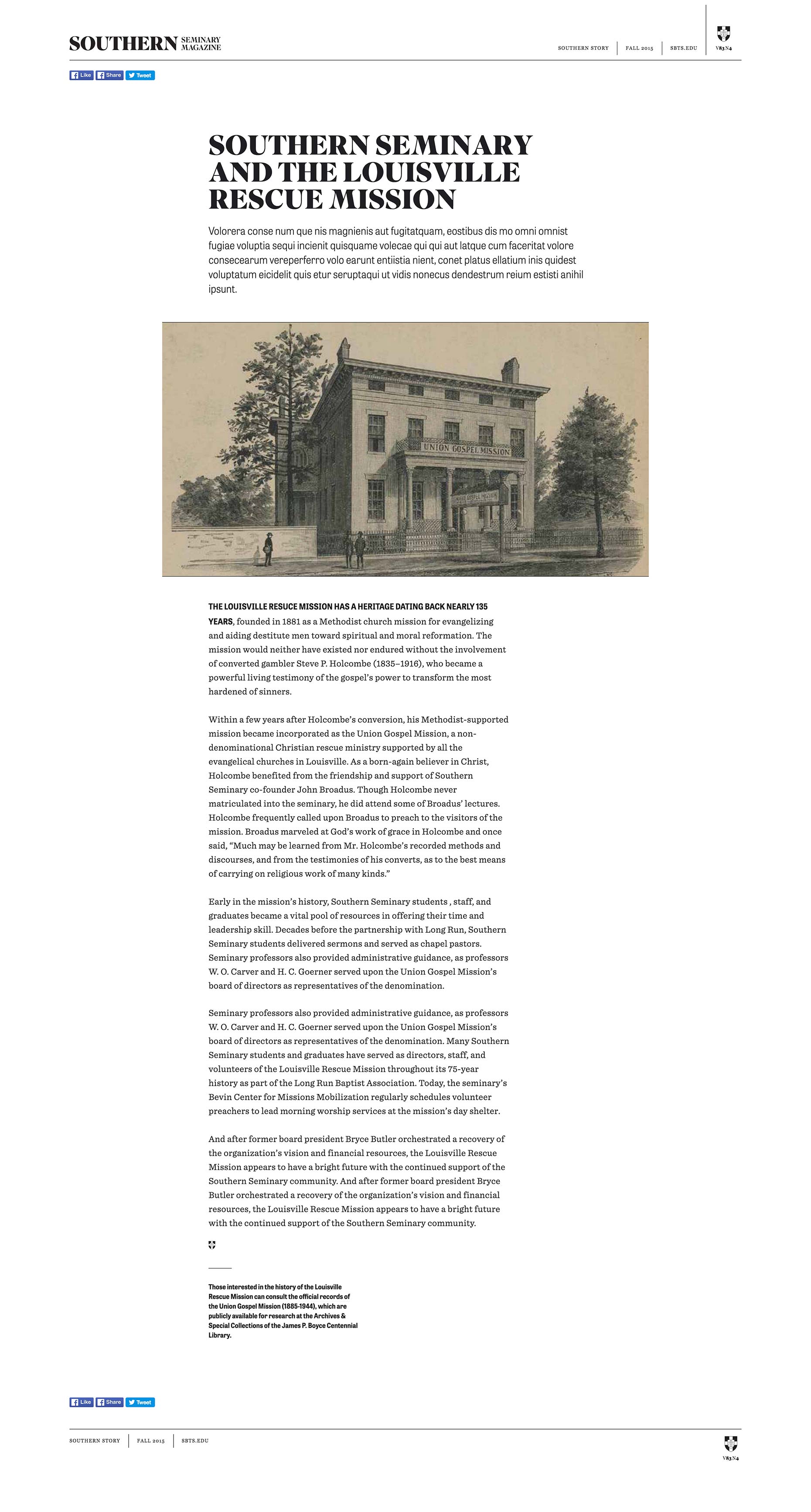
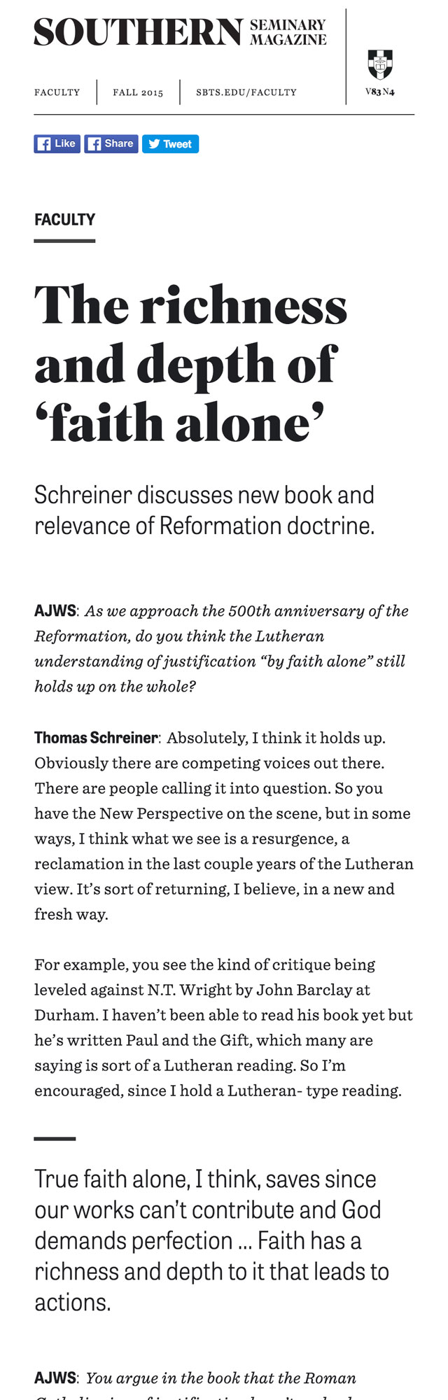
The content input and output needed to be reduced from article layouts to smaller repeatable patterns. To do this I turned to a book written over 50 years ago. But first a few screens for context. Below are a couple spreads from the print magazine and two examples of how that style was translated to the online designs.
“Notes on the Synthesis of Form”
Christopher Alexander
Harvard University Press,
Cambridge, MA / London, England
1964 · 216 pages
Content Management
To discover the most efficient path for development and the most optimized process for content management, I adapted a method of problem solving outlined by Christopher Alexander in his book “The Synthesis of Form.” This methodology revolves around listing the requirements of a project and then eliminating the points of conflict — or misfits — between the solution and the problem.
And key to reducing the points of conflict is being able to understand the problem without bias or assumptions; which, following the book’s process, means moving the solution from the mind to paper to better see and work out the problem.
The book is written using the conditions of architecture and urban planning (with multiple references to physical product design thrown in), and therefore I had to alter the meaning of a stress point or misfit to frame our problem. I defined a misfit as any point of information output. In other words, any point where the design met the data model.
First, I listed and grouped all potential input & output connections. This looked like something as you would first think about it: all the items at the top were grouped into “header”, stuff at the bottom in “footer”, and so forth. Then the main content of the various article types were abstracted into content building blocks. As a whole it presented a rough draft conceptualization of the content independent of the design. This constituted the misfits and my initial mental picture of how to solve it.
Already well aware of the perils of relying on the first idea, I was ready to explore deeper to find the true solution. Alexander frames this in a more academic way as such:
“[The] … designer works entirely from the picture in his mind, and this picture is almost always wrong. The way to improve this is to make a further abstract picture of our first picture of the problem, which eradicates its bias and retains only its abstract structural features” (Synthesis, 77-78)
And further:
“[F]or every problem there is one decomposition which is especially proper to it, and … this is usually different from the one in the designer’s head.” (Synthesis 83)
This decomposition Alexander calls the program and “is a reorganization of the way the designer thinks about the problem.” (Synthesis, 83) It’s the end result of the discovery of the actual problem. Or using the vocabulary of the book, it’s the discovery of the context (problem = context). Creating the program is the analytical phase — the full realization of the context, or problem.
What comes next is “the synthetic phase, in which a form is derived from the program.” (Synthesis, 84) Alexander calls this synthetic phase “the realization of the program.” The end result of the synthetic phase is a fully realized form wherein the form is the solution to the problem (form = solution).
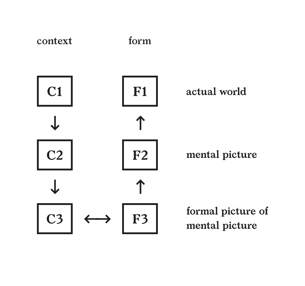
Reproduced diagram from Notes on the Synthesis of Form (p. 76) showing the journey from context to form, or problem to solution.
The process of moving from context to form is illustrated with a very simple scheme on page 76 of the book which I’ve reproduced above. Keep in mind that the mental picture here is referring to how you are framing the problem in your mind, not solely the ideas of what the designed outcomes will look like; though that is part of it. I’m pointing this out since the scenario here is a website, for which most designers form designs “out of their head” (notwithstanding of course all the references in the world that came before). All to say this a complex concept that requires more nuance and study than I am representing here.
Going back to the initial grouping excercise (header, footer, etc.), these first sketches were my initial mental picture of the problem. I then set about to create a formal picture of my mental picture. This involved a lot of sketching, notating sketches, re-sketching, and more. As I worked through the process, repeatable patterns of organization began to take shape, and then, to my delight, patterns of patterns emerged.
When it was finished, instead of a flat abstraction of information, I had a hierarchy tree that mapped out the current information problem in an easy to understand system; and because parallel structures had already been sorted into the system, this program made it an uncomplicated process to add new content types (it would be just a matter of addition) if the need ever arose.

“Every component has this twofold nature: it is first a unit, and second a pattern, both a pattern and a unit. Its nature as a unit makes it an entity distinct from its surroundings. Its nature as a pattern specifies the arrangement of its own component units. It is the culmination of the designer’s task to make every diagram both a pattern and a unit. As a unit it will fit into the hierarchy of larger components that fall above it; as a pattern it will specify the hierarchy of smaller components which it itself is made of.” (Synthesis, 131)
“I’ve looked to David for numerous digital design solutions and he has always exceeded expectations. Most recently, he led the design and product development on a very complex project of high importance to our institution. He was easy to work with — communicating professionally throughout the planning, design and implementation of the project and also creating high-quality deliverables to help present to our leadership.”
Steve Watters, Former VP of Communications, Southern Seminary
Later that year…
2016–2017
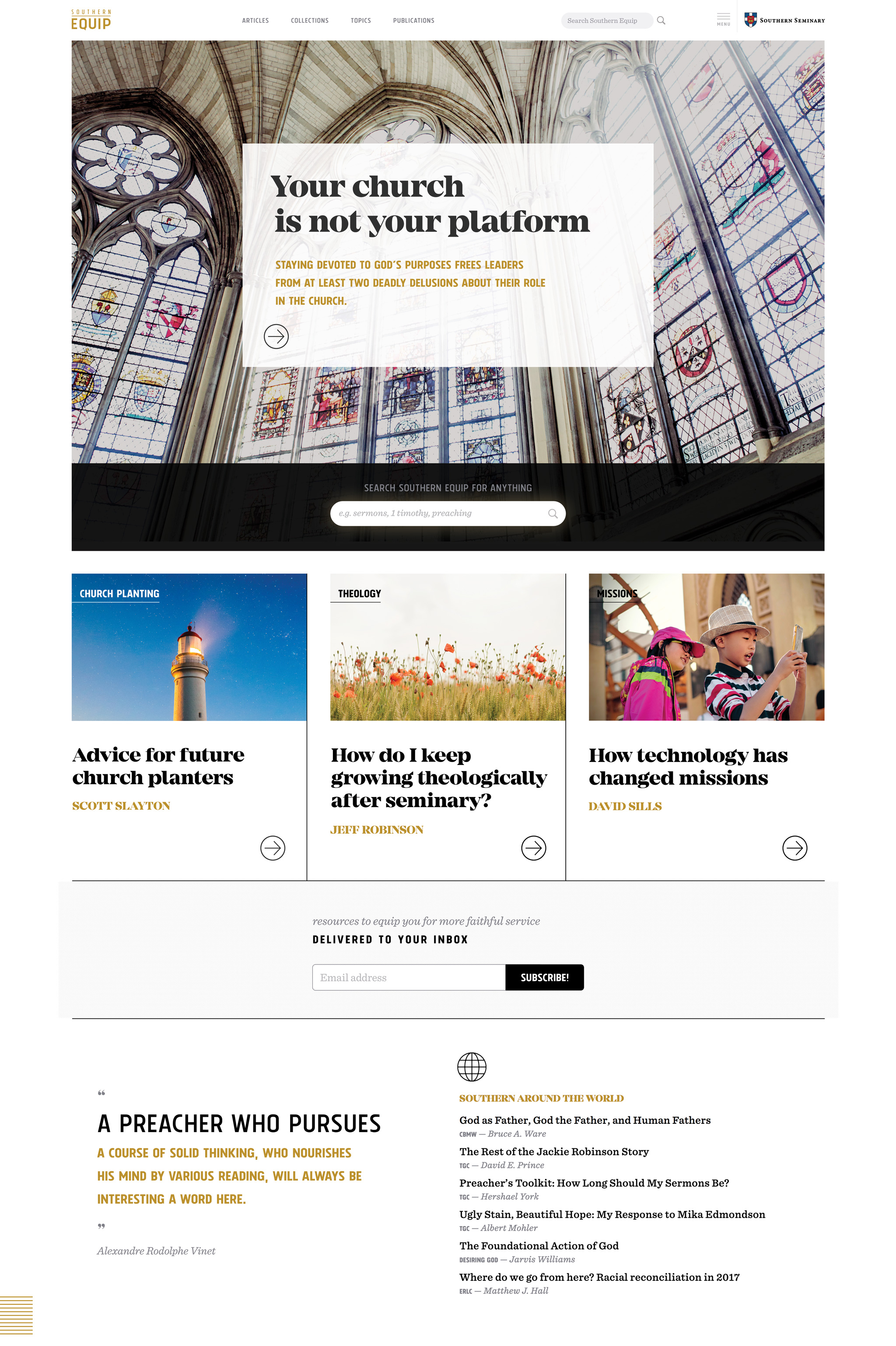
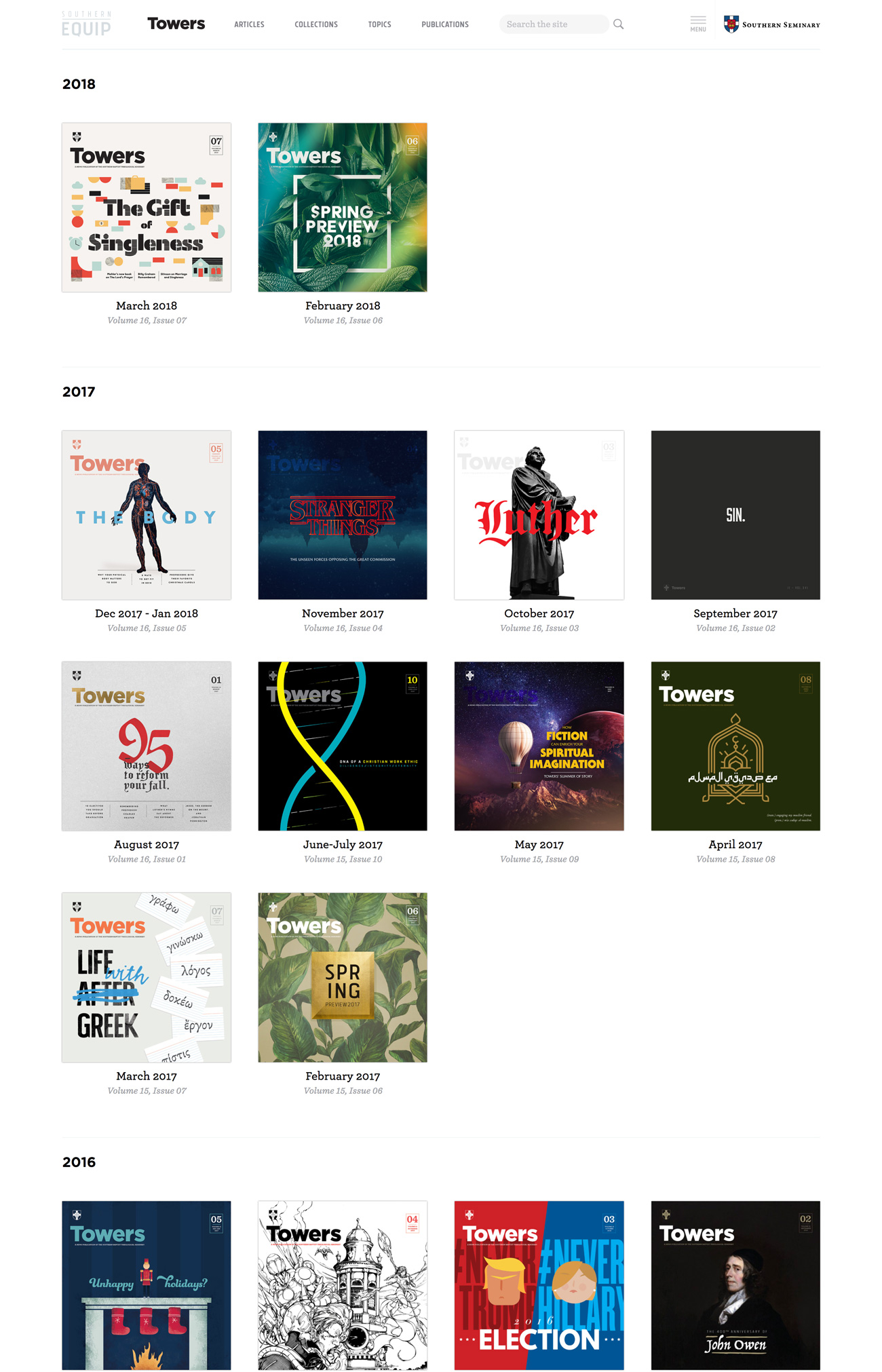
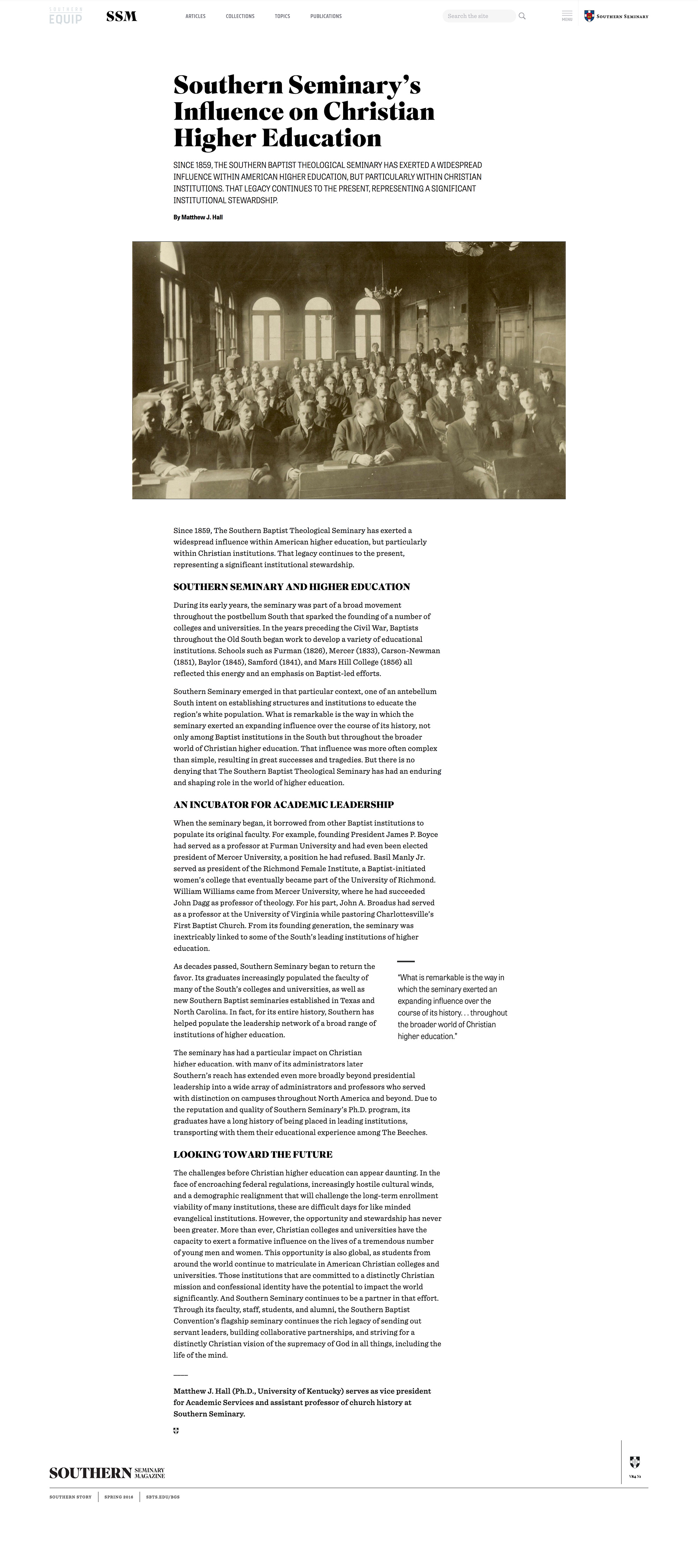
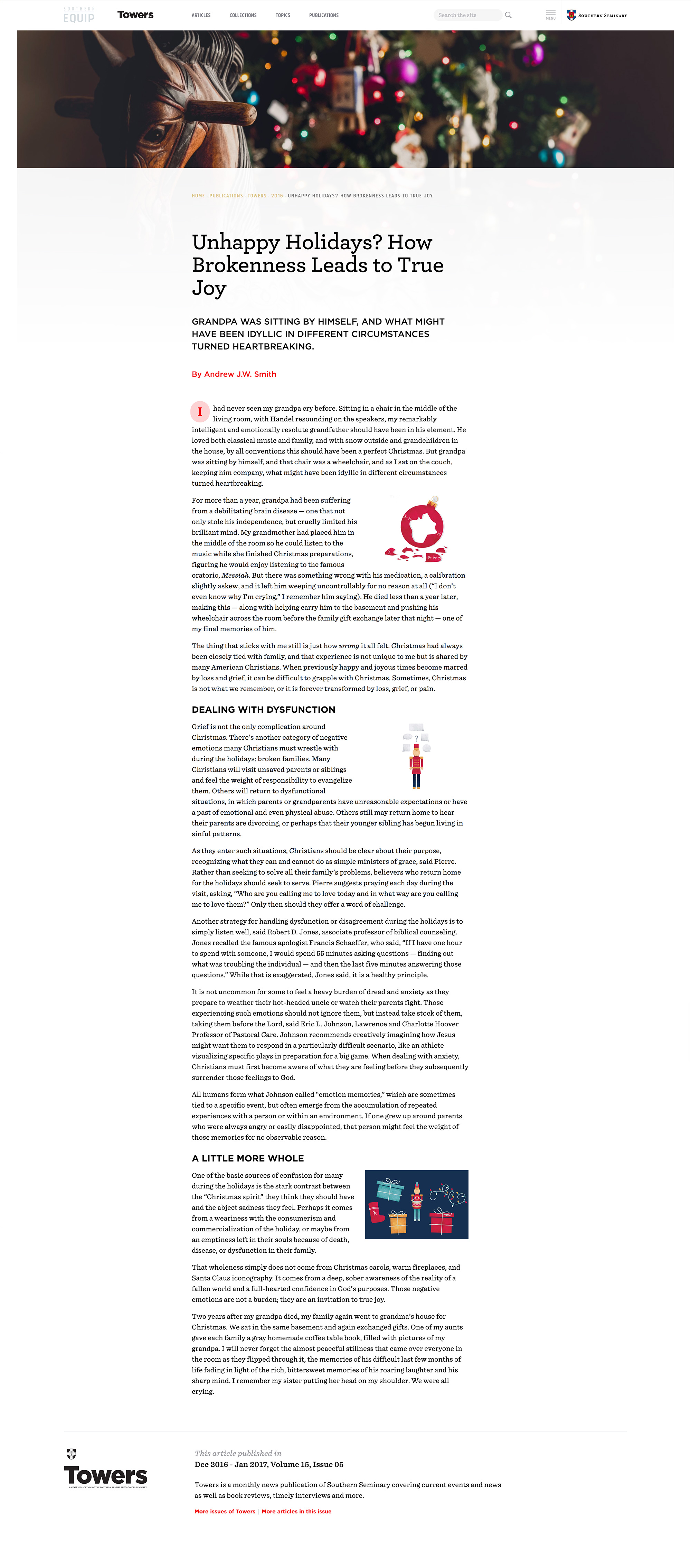
After the magazine project website launched we started a larger project that incorporated all of Southern Seminary’s insitutional resources under a single brand — Southern Equip. (Including the Magazine project discussed above.) The site published primary media through the Equip identity and also serves as a clearinghouse for all other publication channels that existed at the institution.
The primary look and feel of the home page is the Southern Equip brand, but as you navigate to other areas of the site the design integrates the look and feel of individual publications all while maintaining the overall Equip brand. This presented some unique design challenges but instead of talking more about it (there are enough words on this page already) I’ll just show some images from the project.
Note: The logo, type selection, and brand colors for the Southern Equip, Southern Magazine and Towers identity were developed by Southern’s in-house Communications team. I was responsible for the website design and development.
Responsive Design
The following set of images need a little context. As mentioned above, having two logos in the header (three, if you count the parent instutional branding on the far right) posed unique challenges as horizontal space narrowed.
To further complicate matters, both of these logos had primacy and it made sense for both to occupy the typical top left corner in some manner. (The look and feel of the dual-branded articles wouldn’t have been complete without displaying their respective identities.) We tried stacking headers, but that just looked like, well, stacked headers. We decided that the best approach was to just have the two logos side by side with the Equip logo faded out to emphasize the publication currently in view (and to have some impression of hierarchy).
However, with responsive design the mechanics of adding an extra logo proved a bit tricky. But using a combination of @media breakpoints, jQuery (for the search interface), and CSS animations a solution was found. This solution is shown below with a series of representative images of the default and dual-branded header starting with the widest screens and working down to a typical mobile view.


The widest views (>1800px, below) did not pose any problems. I just added the second logo in the extra space.


Next was the 1408px–1800px range and here we already began to run out of space. The regular header was fine, the dual view was not. So for the dual view I hid the search input and displayed only the search icon. JavaScript (jQuery) was used to activate the search input and hide the navigation when the icon was clicked with a cancel link to reset the interface back to the initial state.


Below 1408px, space became even more constricted. For the dual view, I collapsed the institutional branding on the far right earlier than the regular view (which doesn’t happen until sub-480px), and kept the search input hidden with the same function as described just above for both views.


As the viewport narrows towards 960px, the margins of the navigation container and individual main navigation links adjusted to accommodate the ever shrinking space. The images below show how the header appear at 960px directly before the main navigation and the rest disappear behind the standard hamburger menu pattern.


For the 768px–960px range, the entire navigation and search was hidden by default — which freed up space to expand the institutional branding back to its normal view with still plenty of room for an extra logo.


Between 480px and 768px was the same situation as 768px–960px, with the exception that the institutional branding for the dual header view needed to again be compacted.


Finally, below the 480px breakpoint is your typical mobile view. The navigation and search were hidden behind icons as before; and the institutional branding was now compacted for both views; but, there was no longer enough horizontal space for another logo. I did not want to miniaturize the logos, nor did I want to increase the vertical space. So I decided to use a bit of CSS to create an animation that swaps the logos every 3.5 seconds (see above).
Bonus!
Homepage Design
2019
In 2019, I was contracted to design a new homepage for Southern Seminary’s main website. They were rolling out a completely new marketing campaign and needed an updated website to reflect the new messaging and design system. They had a clear, concise plan for what they wanted on the home page and a tight deadline.
Starting from a sketch they did for the homepage, translating the new brand and identity guidelines for the web, referencing site analytics to develop content for the main header dropdown, and leaning on synthesis from a kickoff meeting with key project stakeholders, a dynamic, focused homepage came to life in a little over a month.
See the initial sketch from the VP of Communications and the finished homepage below.
Illustrations by Ruben Cabrera
“David is one of the best designers to work with, especially if you’re an engineer. He understands both sides of execution so well.”
Jason Heath, VP of Campus Technology, Southern Seminary
Highlight
The header and footer design for the homepage was applied throughout the rest of the site. The JavaScript for the header was a particularly tricky because it had to change color schemes when it was over top of the main lead video versus the rest of the site. You can see an animation of this interaction below.