Redeapp
2015-2019- Role & ResponsibilitiesIdentity design, UI & UX design, pitch decks, marketing collateral, email template design, front-end prototyping.
- Technologies & ToolsSketch, CSS/HTML, jQuery
- Years2015–2019
Redeapp is a startup based in Louisville, KY, that helps companies manage their non-desk workforce. Their primary product is a mobile app, which is supported by a suite of web-based admin software. It’s used by GE, Magna, Hard Rock, Panasonic and more. I’ve worked on and off with Redeapp for years; we’ve worked on the brand, marketing materials, investor presentations, infographics, email templates, the website, a web application that’s part of their core product, and more.
Most recently, I worked with them to redesign their homepage to represent a maturation of their product market fit. We redesigned the homepage only, but the header and footer were applied to the other pages as well.
The main challenge was figuring out how to succinctly communicate their five main selling points equally and effectively. The solution was the five-across tab arrangement that cuts into the main lead image. These are the five key elements of Redeapp’s mobile workforce management platform and clicking on each of them dives into the details. The tab headers are clear and catchy (a website is only as good as its copywriting!) and the particulars of each section are engaging as well. Kudos to the Redeapp copywriting team — it’s some of the best text I’ve had to work with.
Administrator Web App
2017
Supporting the mobile app is a separate web application that allows companies to manage and communicate en masse with their workforce. Company administrators can send messages to individual employees and groups, manage resources, see analytics, easily manage staff roles, and much more.
The designs were built according to specifications from detailed user stories as part of their internal Lean methodology. Once a few design mockups were completed, I wrote the front-end markup and CSS for the application and prototyped the rest of the screens and their intended functionality with jQuery. Backend engineers took these HTML prototypes and integrated them into the actual application.
“I AM SO EXCITED for this new admin console. I literally cannot WAIT to start demo-ing it for people. The upgrades to the design and UI are significant — it will be much easier for our customers to use the new console, and we expect that training will be more efficient as a result of the intuitive design. David did an excellent job of learning our product, providing innovative design solutions, and getting feedback from our team throughout the process.”
Hannah Beasley, Director of Customer Success
Brand Design
(2015)
One of the very first projects I worked on with Redeapp was a redesign of their logo. Their product had matured and they needed a refreshed identity to reflect this new sophistication plus future aspirations. The process was highly collaborative and the end result was well received by Redeapp’s staff and their clients and has surprised even me with its versatility.
There were two requirements for the logo refresh: (1) the red color must remain the accent color, and (2) the “e” mark was required to stay in near form to its existing state. The first requirement was easy — one is hard pressed to find a better color scheme than red, white and black. The second requirement made sense and was where I started.
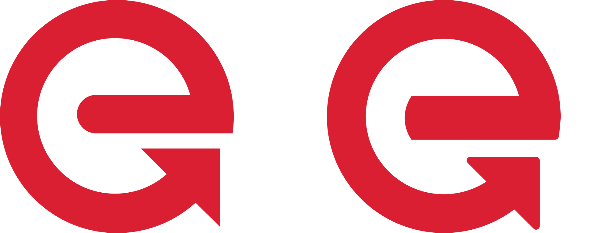
The “e” Mark
I identified three areas of the “e” that needed optimization work:
- The crossbar needed to be thicker. It was the same width as the rest of the letter (more or less) which made it appear thinner than the rest of the letter stroke.
- The end treatment of the crossbar stood out too much. I decided to match the curvature of the inside of the open counter to move the focus from individual elements of the construction to the entity as a whole.
- The points were too… pointy. I rounded the corners of the end arrow a bit and also tucked in and rounded the bottom right corner of the crossbar to give it more of a natural flow and (again) make the entire form more unified.
It now had a more coherent and unified shape. The old “e” is on the left, the new one on the right.
The Logotype
The idea of typing out “redeapp” and replacing the letter e with the mark wasn’t the first idea. Lots of options were explored, but fast forward and the form of the logo had been settled as well as the preferred typeface: Sharp Sans No. 1 Semibold
![]()
Note: What was the Sharp Sans typeface then is now called Sharp Sans Display, and Sharp Sans now is a wholly new typeface.
Below (edited for clarity) is what I wrote when I sent it the logo to Red e App for review, which was the first time they were seeing the updated brand mark as well.
Mark
The “e” mark has changed little. I just rounded the left end of the crossbar of the e and reworked the overall geometry to make the weight of the mark equal throughout.
Logo
The logo is set in Sharp Sans No. 1 Semibold with the letter e being replaced with the “e” mark. The weight of the the letters is the same as the mark so the entire entity flows together well. I did the logo as lower case because of the complexity of the word mark. The branding of Red e App as far as I can tell based on the existing work is capital word, lower case letter, capital word. This makes for a sometimes jarring experience in my opinion because most people aren’t used to seeing a name this way.
The lower case plus capital word is usually mixed with the lower case letter in front: eBook, iMac, iPhone, etc. You can’t run the words together because the e gets lost: RedeApp. You could camel case it: RedEApp, but then you lose the harmony with the mark being a lowercase e. On that note, I think Red E App reads better than Red e App but of course again you lose the connection with the lowercase e.¹
All that to say, that’s why this option goes with all lowercase. For that reason, Sharp Sans No. 1 was chosen as the logotype because its lowercase letters are fantastic.
Overall they were very happy with the proposed logo. However, they wanted to see a couple more options with typefaces similar to Sharp Sans. I came back with one using GT Walsheim and another FF Mark. These are shown below along with the original Sharp Sans version.
![]()
![]()
![]()
For the final version they chose FF Mark. Their reasoning was two fold: (1) The letter e in the logotype wasn’t as similar in form as the “e” mark, and (2) the letter widths in the logotype were more narrow than the “e” mark. Both great reasons.
Today the logo seems perfect and I can’t imagine it being set in any other typeface. And somewhere in this sentiment is also the lesson that the visual strength of a brand comes from being used frequently and consistently.
Footnotes
- Several years later the way to reference the company name in print was settled: Redeapp. (See the homepage design at the top .)